Unlocking the Magic of Taupe: A Comprehensive Guide to Color Pairing

Taupe, that enigmatic chameleon of the color world, often whispers elegance and sophistication. But its versatility can also be intimidating. What colors truly bring out the best in this nuanced neutral? This guide delves into the art of pairing taupe, unlocking its potential to create stunning spaces and ensembles.
From subtle shifts in shade to bold contrasting hues, taupe offers a surprisingly wide range of coordinating options. Understanding its undertones is key to successful pairings. Is your taupe leaning towards gray, brown, or green? This subtle difference dictates which colors will harmonize most effectively.
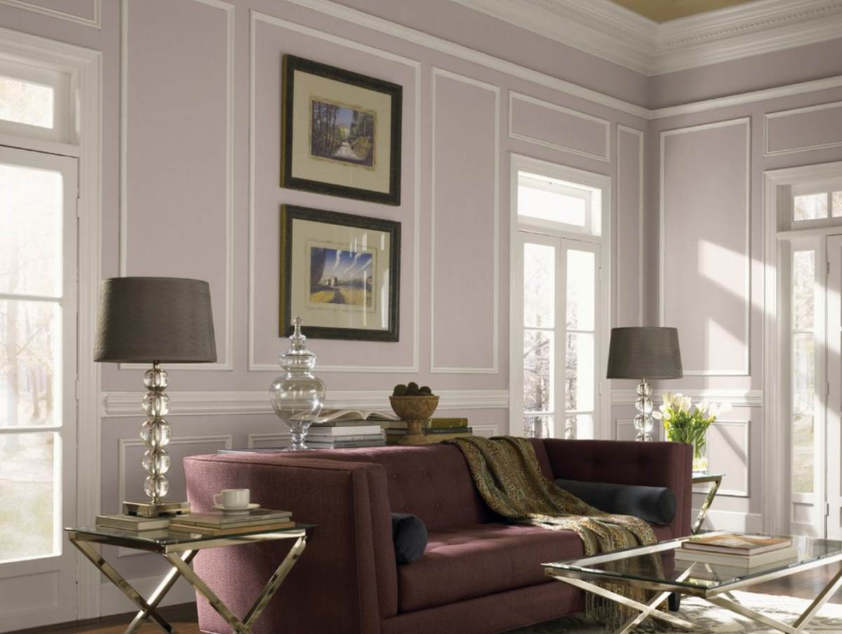
Imagine a room bathed in the gentle warmth of taupe. Now, picture introducing accents of vibrant teal, creating a dynamic interplay of cool and warm tones. Or perhaps a softer touch, layering taupe with creamy off-whites and natural linens for a serene and inviting atmosphere. The possibilities are endless.
Taupe's neutrality allows it to serve as a sophisticated backdrop, allowing other colors to shine. It's the perfect canvas for creating a space that feels both timeless and contemporary. Whether you're decorating a living room, choosing an outfit, or designing a website, understanding taupe's color affinities is essential.
This comprehensive guide will explore the various color palettes that work beautifully with taupe, providing inspiration and practical advice for incorporating this versatile hue into your life. From understanding its origins to mastering its modern applications, we'll unlock the secrets to making taupe truly sing.
The name "taupe" originates from the French word for the European mole. Its earthy, muted tone reflects this connection to nature. Historically, taupe has been associated with practicality and understated elegance. While it may have humble beginnings, taupe has become a mainstay in interior design, fashion, and even graphic design.
One of the main issues when working with taupe is its variability. Different shades can have vastly different undertones, making it crucial to test colors together before committing to a scheme. Understanding the specific shade of taupe you're working with is the foundation for successful color coordination.
For example, a gray-taupe pairs beautifully with cool blues and greens, while a brown-taupe complements warmer tones like burnt orange and deep reds. A green-taupe can be enhanced by pairing it with other nature-inspired shades like olive green and mustard yellow.
One of the benefits of incorporating taupe is its ability to create a sense of calm and tranquility. Its neutral nature makes it a perfect backdrop for relaxation and focus.
Another benefit is its versatility. Taupe works well in any season and can be easily adapted to different styles. This adaptability makes it a timeless choice for both fashion and interiors.
Finally, taupe enhances other colors. It allows brighter hues to pop while providing a grounding element that prevents a space from feeling overwhelming.
A simple way to implement taupe is to start with a neutral base. Paint your walls taupe and then introduce accent colors through furniture, textiles, and accessories. This allows you to experiment with different color combinations without making permanent changes.
Advantages and Disadvantages of Using Taupe
| Advantages | Disadvantages |
|---|---|
| Versatile and adaptable | Can appear bland if not paired correctly |
| Creates a calming atmosphere | Subtle undertones can make color matching tricky |
| Complements a wide range of colors | Requires careful consideration of lighting |
Best practices for incorporating taupe include considering lighting, testing paint samples in the actual space, and layering textures to add depth and interest.
Real-world examples of successful taupe palettes include pairing it with navy blue for a classic nautical look, combining it with blush pink for a soft and romantic feel, or using it with emerald green for a touch of drama.
One common challenge is choosing the right shade of taupe. The solution is to order paint samples and test them in your space under different lighting conditions.
Frequently asked questions about coordinating with taupe include what colors go best with taupe, how to choose the right shade of taupe, and how to use taupe in different rooms of the house. The answers often depend on personal preference and the specific shade of taupe in question.
A helpful tip for working with taupe is to use a color wheel. This visual tool can help you identify complementary and contrasting colors that will work well with your chosen shade of taupe.
In conclusion, understanding what colors harmonize with taupe unlocks a world of design possibilities. From creating serene and sophisticated spaces to adding a touch of understated elegance to your wardrobe, taupe's versatility is undeniable. By carefully considering its undertones and embracing its adaptable nature, you can harness the power of taupe to create truly stunning visual experiences. So, go ahead, experiment with different color combinations and discover the magic of taupe for yourself! Don't be afraid to play with textures and patterns to add depth and visual interest. Whether you're a seasoned designer or just starting your decorating journey, taupe offers a timeless and elegant foundation for any project. Embrace its versatility and unlock its potential to create spaces and ensembles that reflect your unique style.
Unveiling the meaning of eliandra history significance and more
Navigating adt contract termination your guide to contacting the cancellation department
Diy floating boat lift build your own boat hoist


