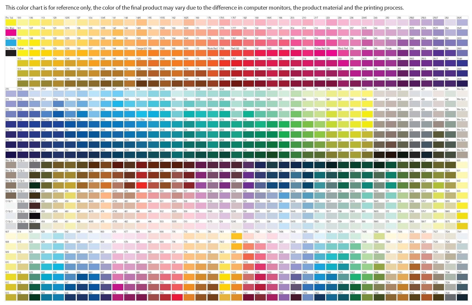
Decoding White: The Pantone Story

White. The absence of color, the symbol of purity, the blank canvas. It’s everywhere, yet it’s often overlooked. But for designers, marketers, and anyone working with visual communication, achieving the *perfect* white isn't so simple. It's a carefully calibrated choice, often dictated by Pantone, the global authority on color.
Navigating the world of Pantone white shades can feel like wandering through a snowfield – vast and seemingly uniform, but subtly different upon closer inspection. This article delves into the nuances of "Pantone white," exploring its various iterations, its significance in branding and design, and how to effectively utilize it in your projects. We’ll unravel the complexities of achieving true white, from understanding its various coded representations to practical applications and common pitfalls.
While the concept of a "Pantone code for white" might seem counterintuitive, Pantone doesn’t just catalog vibrant hues. They standardize whites, creams, and subtle variations thereof, ensuring consistency across different mediums. Think of it this way: "white" on your computer screen might not match the "white" of your printer paper, and neither might accurately reflect the "white" of your company's branded packaging. This is where Pantone comes in, providing a universally understood language for specifying precise shades.
The history of Pantone’s involvement with white is intertwined with the development of color matching systems as a whole. As industries like printing and graphic design demanded greater color accuracy, the need for standardization became apparent. Pantone emerged as a leader, creating a system that transcended subjective descriptions and provided objective color references. This included codifying various whites, addressing the inherent variability in paper stock, inks, and other materials.
Understanding the significance of specifying a Pantone white goes beyond aesthetics. It’s about ensuring brand consistency. Imagine a company's logo, meticulously designed in a specific shade of white, appearing slightly off-color on different marketing materials. This inconsistency can subtly erode brand trust and professionalism. By using a Pantone white designation, designers and printers can guarantee that the intended shade is replicated faithfully, regardless of the printing process or material used.
Pantone doesn't offer a singular "white" but a range of whites and near-whites. While Process White is often used as a standard reference, other options, like Bright White or opaque whites on coated stock are chosen depending on the project's needs. Unfortunately, Pantone doesn't publish these codes freely online. Accessing the full range often requires purchasing physical Pantone guides.
One of the benefits of using Pantone white is achieving precise color matching across various media. Another advantage is maintaining brand consistency, as discussed earlier. Finally, using a standardized system simplifies communication between designers, printers, and clients. Everyone understands the specific shade being referenced, reducing the risk of misinterpretations and costly errors.
Advantages and Disadvantages of Using Pantone White
| Advantages | Disadvantages |
|---|---|
| Precise Color Matching | Cost of Pantone Guides |
| Brand Consistency | Limited Online Availability of Codes |
| Improved Communication | Potential for Metamerism (color appearing different under various lighting) |
Best Practices for Implementing Pantone White:
1. Consult physical Pantone guides for accurate color selection.
2. Clearly communicate the chosen Pantone white code to your printer.
3. Conduct press checks to ensure accurate color reproduction.
4. Consider the substrate when selecting a Pantone white, as different materials can affect the final appearance.
5. Be aware of potential metamerism issues and test your chosen white under different lighting conditions.
Frequently Asked Questions:
1. What is the most common Pantone white? Often Process White, but it depends on the application.
2. Where can I find Pantone white codes? Primarily in physical Pantone guides.
3. Why is my printed white not matching the Pantone swatch? This could be due to several factors, including substrate, ink, and printing process variations.
4. Do I need to use a Pantone white for my project? It depends on the project's requirements and the level of color accuracy needed.
5. What is the difference between Pantone white and process white? Process white refers to the white of the substrate, while Pantone white refers to a specific shade within the Pantone Matching System.
6. How do I select the right Pantone white for my project? Consider the substrate, printing process, and desired final appearance.
7. Are there different Pantone whites for different types of paper? Yes, certain Pantone whites are formulated for specific paper types, like coated or uncoated stock.
8. Can I mix my own Pantone white? No, Pantone whites are pre-formulated inks intended for precise color matching.
Tips and tricks for working with Pantone whites include considering the impact of surrounding colors and testing different Pantone white options on your chosen substrate.
In conclusion, understanding and utilizing the right shade of "Pantone white" is crucial for achieving consistent brand identity and high-quality print results. While the concept might initially seem simple, navigating the nuances of different whites requires attention to detail and an understanding of the Pantone Matching System. By following best practices and consulting physical Pantone guides, designers can ensure their vision of white translates seamlessly from concept to reality. Embracing the complexities of white opens up a world of possibilities, allowing for greater control over the final printed piece and reinforcing the importance of seemingly subtle details in achieving effective visual communication. Consider this your starting point in mastering the art of white, a journey that goes beyond the absence of color and dives into a world of nuanced distinctions. Start exploring and discover the perfect Pantone white for your next project.
Lost malaysian ic appeal letter guide
Dead toyota rav4 key fob learn how to replace the battery
The vast world of football in ea sports fc 24 leagues


